What Am I currently working on?
Made using Sketch and Adobe Illustrator
My most recent project has been the UX, UI, and graphic design for a friend’s startup: embrr, a forum-based social media platform for people in the technology field to share knowledge and ideas. Click the button below to view embrr in it’s current state.
The problem
My co worker Kyle approached me with an idea for an online forum-based social media platform for technology. He defined a need for a place where tech-savvy individuals can go to share all the cool projects they are working on, and get ideas from a community of like-minded individuals.
He wanted to create boards with a specific purpose that would give users a place to share without sorting through a ton of unrelated content or being as specialized as a sub-Reddit. I started by sketching what I thought these boards could look like.
Click on images to enlarge them


The boards


The homepage


The dashboard
These sketches helped me clarify what elements I would need to make a project like this work and give Kyle an idea of what functions we will need in. I wanted to keep the design simple and focus on organizing the boards and not overload the user with unnecessary UI.
Iteration
I began some wire frames without a color palette or icons. I wanted to get a feel for our layout and understand it a bit better on screen as opposed to on paper. What should we be looking to deliver when Kyle starts coding the site and how can we get a sleek but effective design to our end users.
Below are the basic wireframe screens of the site made in Sketch, I think this helped Kyle understand what I needed as a designer and it made me think more about what a successful forum platform should look like.
Click on the images below to see the full screen.


Color palettes, logos and icons
Logos
We decided on a name and a color palette so I began with the idea of a small flame similar to the one I used for the trending page in the above wireframe but it was a little to simple. I wanted embrr to stand out and I wanted an iconic logo to match our big ideas. Here are some of the logo’s I mocked up using Adobe Illustrator.


The winner
We went with this logo as the face of embrr because it stood out as being interesting yet simple enough to catch your eye.
Icons
With a color palette and a logo I started designing the icons for this project. Kyle decided on our final categories and these are the icon designs I created in Sketch to match.

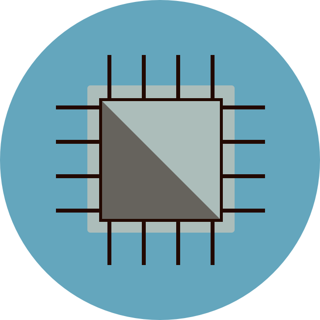


I was able to incorporate my original idea for different colors for each board while still keeping to our bold palette and logo. It allows me to spin up some icons like a new post button and a settings icon with ease since the style is so simplistic, and should make future expansion much easier.


Palette implementation
I started with the homepage and fleshed out what our existing wireframe would look like with our new colors and icons. With this iteration we did cut the need for a trending page, there’s no room on one site for two different fire icons.
Click on the images below to see the full screen.


Redesigning the board
After applying the palette, I decided that our board was a little too simple, I didn’t want users coming to a fancy manilla envelope to post about their passion so I began some rapid mock-ups on my prior ideas of the boards. I completely redesigned the posting system and added some realer ad images to make the posts feel more like they could actually exist on a real site. I also decided to test out the other colors just to make sure we could use a gradient to make them jive with our bright orange.
Click on the images below to see the full screen.


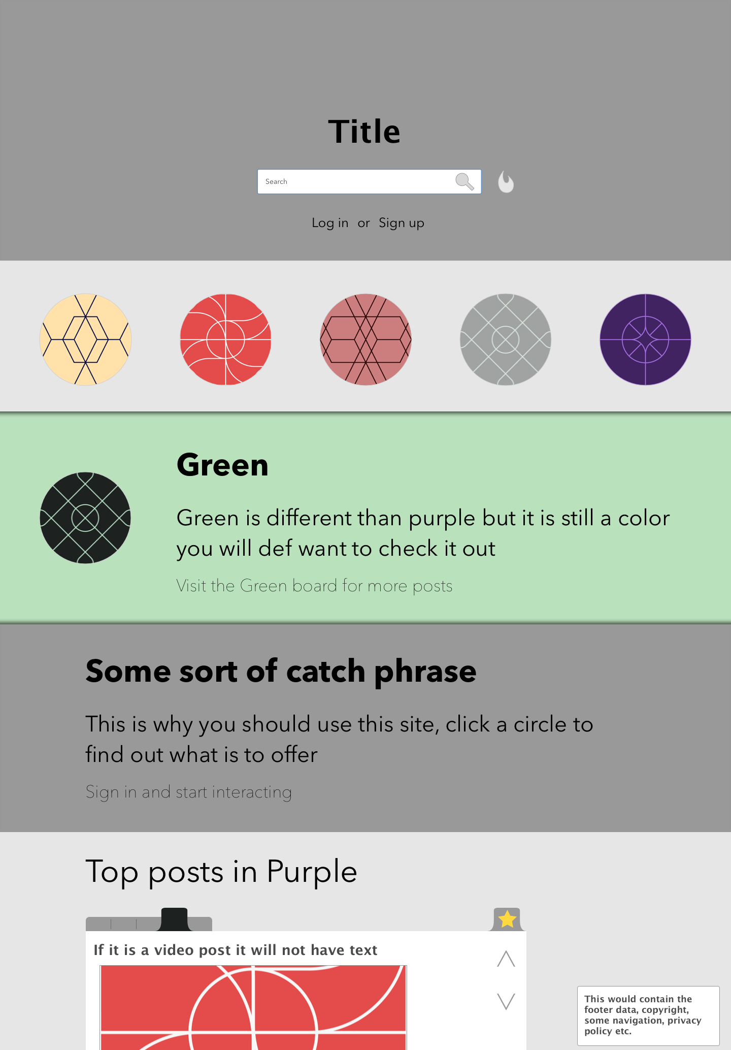
The chosen design
After presenting my designs to Kyle, we decided on this design to use going forward. We liked the simple UI for the boards with the focus on the posts and the static data on the left instead of the right. I think it creates a better flow for the pages and will look a lot better with infinite scrolling for a forum.
Implementation
Click on the images below to see the full screen.


Now that we have a majority of our design and layout started, we are focusing on the backend and creation of the site. I will be involved with some of the front-end coding HTML and CSS but will mostly be assisting with asset creation, maintenance, some merchandise design, and in the future, and some administrative duties. I did end up creating some miscellaneous designs for Kyle such as the post creation screen and profile page, shown on the right.
If you would like to sign up to receive notifications on our progress please click the embrr button below and sign up! I’m going to continue to work on the site and update this page as we go as we iterate and implement this design.