Vision Website Overhaul
For MI 349: Website Design and Development using Adobe photoshop and HTML/CSS via text editor
This project centered on the redesign process of an existing website or creation of a new one. I chose to redesign my parents' website for their production company Vision Performance Group and Technologies the site is still in progress for actual launch and the old design may now serve as a frame of reference for your viewing pleasure.
One Pager
The first step of this design process was to compile a one pager to define our intentions, evaluate competitor sites, and provide personas for possible use comparisons. This gave the instructor a frame of reference for those who had no real client and prepared those who had one to present the design prospects to the client in a professional and understandable manner.
My Personas - these helped me figure out how my layout should be arranged. These are the most common users we could expect on the site and thus should focus on creating a sensible workflow for. them to get the information they need.

My goal and mission statement, this provided me with a spot to look back at as well as to provide to my client to ensure we were on the same page for the direction I wanted to take the site.
My comparable websites, I chose Sweetwater - a competitor that I wanted to use as inspiration due to their logical structure and user layout and Bose - for their sleek design and general ascetics.
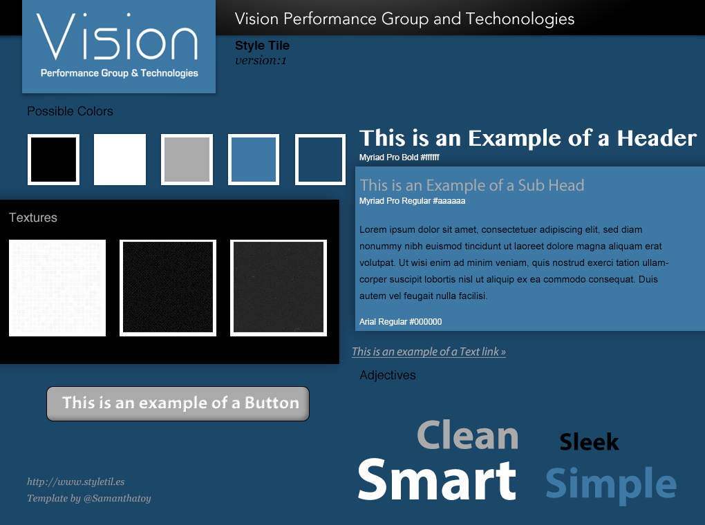
Style Tiles
These were a pre-process design step to help guide our final project into a more finished piece. We selected color pallets, fonts and layout patterns to have a more thoughtful and put together design when it came to implement the final product in HTML/CSS form.
This tile was good for a reference point and a learning process. Grey is one of my favorite design colors but I often need to see it work to understand how it should fit into my designs. This ended up being too much grey and not enough color to make the final cut and would end up being overall too dark.
This tile was the one I ended up implementing as it had a more appealing layout with color and matched most of what their existing site's good features so I could focus on fixing the ones that needed more work.

Site Mockup
This design step helped us map out how the homepage should look and expedite the final coding process but giving me a frame to start with. Similar to wire framing this mock-up was very useful in my final design and definitely cut time off the creation of my final product.
A sliding menu (on the splash page only) that would add some motion to the page and draw attention to some of the companies bright points
Two floating panels that provide the information that is important to the core identity of the organization, this is static on all pages, a request from the client.

A clear and legible navigation menu with clearly defined menus to lead users directly to the information they need.
Content linked to the sliding content to provide users with the information that grabbed their attention without leaving the page they were on and provide a fluid user experience
Contact information available on each page with clickable email and phone links for SEO and contacting purposes.
The Final Product
As stated above, the final website has yet to launch from my parents' domain, I will be hosting it on my domain soon so it is available to click around in.